Chapter 19 — Reading a gold chart: the four timeframes
A trader staring at a single timeframe is half-blind. The mistake is universal — beginners fixate on one chart (usually the daily, sometimes the 1-hour) and try to draw all of their conclusions from it. They miss what timeframe should actually be used for what.
A gold chart has four timeframes that matter, each answering a different question. Monthly answers regime. Weekly answers trend. Daily answers swing. Four-hour or one-hour answers execution. Pulled together, the four timeframes form a coherent multi-resolution view that tells a trader where they are, what bias they should hold, and exactly where to enter and exit.
This chapter is about how to read each timeframe, what to look for, and — critically — what to ignore on each one.
The monthly chart: regime
Monthly candles cover 21 trading days each, roughly a calendar month. The monthly chart shows what the price has done over years and decades. Most retail traders never look at it. This is a mistake.
The monthly chart answers a single question: what regime are we in?
You are looking for:
- The 200-month moving average. Roughly 17 years of price. Price above this is a long-term bull regime; below it is a long-term bear. Gold has been above its 200-month MA continuously since 2003. The MA itself currently sits around $2,400 — that is the long-term fair value zone. Anything below would represent a structural reset.
- The major regime ranges. Where did the previous bull market top? Where did the previous bear bottom? These are reference levels that algorithms and institutional traders watch for years.
- The current macro structure. Are we in a multi-year uptrend (higher highs, higher lows on the monthly)? Multi-year sideways (consolidation between two levels)? Multi-year downtrend?
What to ignore on the monthly chart: indicators, oscillators, anything but the price itself. The monthly chart is for the structural read. Indicators add noise without adding signal at this resolution.
Look at the monthly chart once a week, on Sunday or Monday morning. Five minutes. Confirm or update your view of the regime.
The weekly chart: trend
Weekly candles cover five trading days. The weekly chart shows what has happened over months and quarters. This is where the trend lives — the direction price has been moving over the past several months, the trend's character (smooth or choppy), and the levels that the trend has respected.
The weekly chart answers: which direction is the wind blowing this season?
You are looking for:
- The 50-week moving average. Roughly one year of price. Price above this and the average rising = clear bullish trend. Price below this and the average falling = clear bearish trend. Price chopping around the MA = trend is uncertain, range conditions likely.
- The structure of higher highs and higher lows (or lower highs and lower lows). A clean uptrend has price making successive higher highs and higher lows on the weekly chart. A clean downtrend has the inverse. Anything else is a range or transition.
- The major weekly swing levels. Recent significant highs and lows. These are levels that will matter on the daily and hourly charts as well.
What to ignore on the weekly chart: tight indicator signals, candle patterns that resolve within 1-2 weeks, news headlines from individual days.
Update your weekly view once a week. Sunday or Monday is the natural time, after Friday's close.
The daily chart: swing
Daily candles cover one trading day, with the gold market's continuous 24-hour pricing closing at 5 PM New York time. The daily chart shows weeks to a couple of months of price action. This is where most of the actionable trading setups live — the multi-day swings that a discretionary trader is looking to enter and ride for 3-15 days.
The daily chart answers: where is the current swing, and what is the next likely level?
You are looking for:
- The 20-day and 50-day moving averages. Short-term dynamic support and resistance. In an uptrend, pullbacks to the 20-day MA are typical buying opportunities. In a downtrend, rallies to the 20-day MA are typical shorting opportunities.
- The Average True Range (ATR). The 14-day ATR tells you the typical daily price range — usually around $25-35 in gold's recent regime. This is the basis for stop placement and position sizing (Chapter 25).
- Daily swing highs and lows. The peaks and valleys of recent price action. These are the levels where stops and breakout traders are positioned.
- Pattern recognition. Bull flags, bear flags, double tops, head and shoulders. These do work on gold's daily chart when aligned with the macro bias. They fail consistently when traded against the macro tide.
What to ignore on the daily chart: long-term levels that are far from current price, indicator signals that conflict with the weekly trend.
The daily chart is where you spend the most time. Check it at the daily close (5 PM New York time, which is 1 AM Dubai, 9 AM Beijing the next day).
The 4-hour or 1-hour chart: execution
The 4H and 1H charts (use whichever fits your trading style) show the past few days of price action with enough granularity to identify specific entry and exit points.
These charts answer: exactly where should I get in or out?
You are looking for:
- Order block formation. SMC concepts described in Chapter 22 apply directly to these timeframes.
- Session structure. The Asian range, the London open, the New York open. Gold has predictable behaviors at each session transition that the 4H/1H chart reveals.
- Specific entry triggers. A breakout candle, a rejection candle, a momentum surge that confirms the higher-timeframe setup. Reading these candles is its own skill — see Chapter 21.
- Tight risk levels. Stops on execution timeframe trades are 2-4x ATR-on-execution-timeframe, which is much smaller than 1x daily ATR.
What to ignore on the 4H/1H chart: longer-term structure (already known from higher timeframes), news headlines from hours ago (already priced in), pattern signals that conflict with the daily trend.
The 4H/1H chart is what you watch during your active trading window. Open it when you are looking to place a trade or manage one; close it the rest of the time.
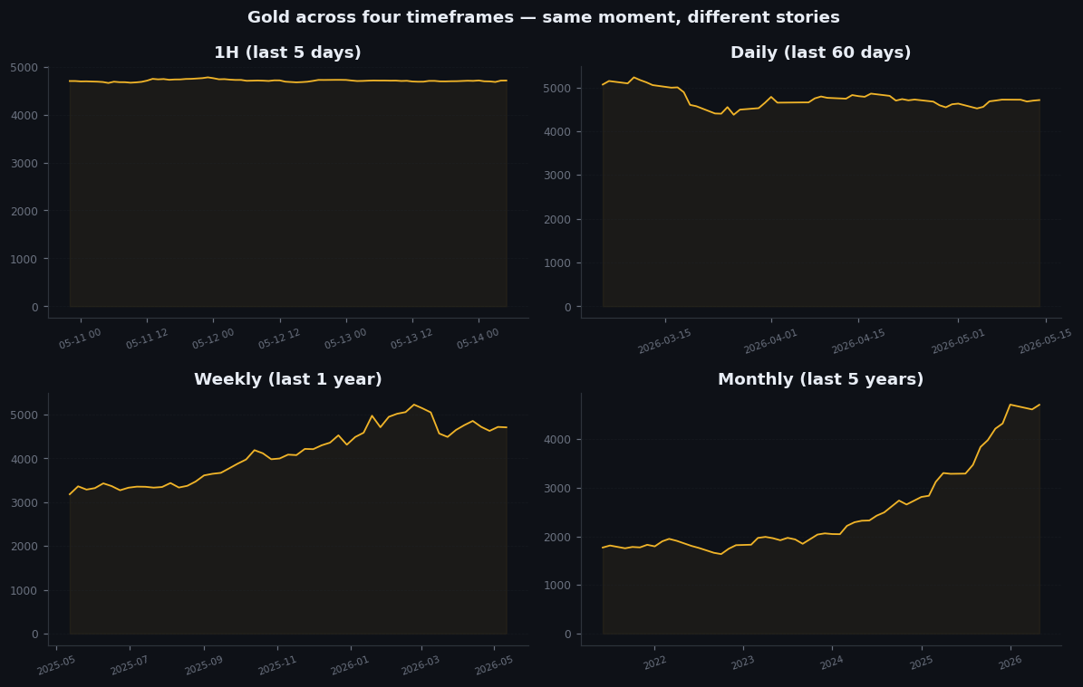
Figure 19.1 — Gold across four timeframes, same moment
Four-panel chart. Top-left: monthly chart showing the multi-decade uptrend with the 200-month MA. Top-right: weekly chart showing the current multi-quarter trend with the 50-week MA. Bottom-left: daily chart showing recent swing structure with 20 and 50 daily MAs. Bottom-right: 4-hour chart showing the current session structure with specific entry triggers visible. Each panel labeled with what it answers (regime/trend/swing/execution). All four panels are the same moment, the same instrument — just different resolutions.
The integration discipline
The mistake on the way up is to start with the lower timeframes and build up. This produces fragmented analysis where the trader sees patterns on the 4H and tries to retrofit a macro thesis.
The correct workflow is the reverse: start at the monthly, build down. Establish the regime first. Confirm the trend. Identify the swing. Then look for the execution trigger.
A trade that aligns across all four timeframes (monthly bullish, weekly bullish, daily bullish, 4H breakout) is a high-probability setup. A trade that conflicts across timeframes (e.g., monthly bullish, daily bearish, 4H breakout) is a low-probability setup that requires a specific reason to take.
The single most useful sentence to remember: the higher the timeframe, the heavier its weight. If the monthly says one thing and the 4H says another, trust the monthly. The 4H signal might still produce a quick trade, but it is fighting the deeper current.
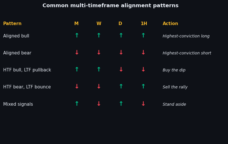
Figure 19.2 — Common multi-timeframe alignment patterns
Diagram. Three labeled scenarios. Scenario A: "All aligned bullish — monthly up, weekly up, daily up, 4H breakout up. High-probability long. Size up." Scenario B: "Mixed — monthly up, weekly up, daily down, 4H bouncing. Pullback setup. Long with tight risk." Scenario C: "Conflicting — monthly up, weekly down, daily down, 4H breakout up. Counter-trend bounce. Small, quick, exit fast." Each scenario with a simple win-rate and expected return summary.
Illustrative — schematic — MTF alignment patterns.
On goldintel today
The dashboard's chart panel (when set to the multi-timeframe view, if available) shows daily and intraday. The Technical Indicators panel pulls ratings across multiple timeframes simultaneously and reports them — which gives you a quick read on alignment without flipping between charts. The session briefs explicitly note multi-timeframe alignment in their factor scoring.
For long-term context (monthly and weekly), use a separate TradingView tab or the daily chart's zoom-out view. The dashboard is not optimized for monthly structure analysis; that is best done on a dedicated charting platform.
Common mistakes
- "I'll just use the 1-hour chart." You will miss the regime, the trend, and the swing context. Your win rate will be near 50% and you will lose to costs.
- "I'll use all six standard timeframes." Diminishing returns. The four in this chapter cover the relevant scales. Adding more (the 15-minute, the weekly outside of the four) produces overlap and noise.
- "Monthly is for long-term investors, not traders." Wrong. The monthly tells you which side of the macro tide to trade. Even a day-trader needs that read.
- "The 4H pattern is the best signal." Only when aligned with higher timeframes. A 4H breakout against a daily downtrend is a setup with a 30-40% win rate at best.
Key takeaway
Four timeframes, four questions: monthly = regime, weekly = trend, daily = swing, 4H = execution. Work top-down. Trust the higher timeframe when they conflict.
Further reading:
- Alexander Elder, Trading for a Living. The multi-timeframe approach is laid out cleanly here.
- John Murphy, Technical Analysis of the Financial Markets. Older but still the standard reference for multi-timeframe chart reading.
- ICT (Inner Circle Trader) educational content on YouTube — controversial but the multi-timeframe principles are sound.
Quick reference
| Timeframe | Role | Tool focus | Decision cadence |
|---|---|---|---|
| Monthly | Regime / cycle anchor | Trend, real yields, CB flow | Quarterly review |
| Weekly | Swing context | Pivots, weekly close direction | Sunday plan |
| Daily | Trade selection | Setups, daily S/R, daily ATR | Pre-session |
| 1H / 15m | Entry / exit timing | SMC, BOS/CHoCH, intraday RSI | Live during trade |